|
Kerning: the spacing between a pair of letters. |
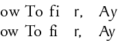
Text Control: KerningKerning is adjusting only a pair of letters, separate from any adjustments you may make to a larger body of text. Some letters look very awkward next to each other and may need to be brought closer together or spread apart for a more "natural" look. Other times, a designer may tighten the kerning on certain letters for a nice effect. Some fonts appear as though each letter has a sort of imaginary box of space around it that no other letters can invade; kerning allows you to gracefully overlap the space of two letters so they look like they belong together instead of like they're trying to avoid each other. The third set of letters is a very common set to kern. Set at default, the dot of the i blends slightly with the end of the curve on the f. Some people like to spread the two apart, as in the top example, so the i is independent of the f. Others like to completely join the dot of the i with the curve of the f for a fluid appearance (a case where kerning is used more for personal preference than for readability or legibility.) |
|