Humanist sans serifs are a reactionary form to the geometric movement. Many of them are modern fonts and exhibit characteristics found in the older, roman forms. They frequently have significant variations in line width, inclined counters, and irregular outlines.
Lydian is one of the newer humanist fonts. Notice the slanted chisel shapes at the ends of the strokes and the variation in the line width. The font feels like it might have been painted with a brush.
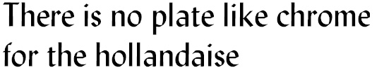
Optima has a definite variation in line weight and a more "organic" feel to the letter shapes. There is some variation in the vertical strokes and a distinct difference in the heights of ascenders and upper case letters. While not a bad font for screen display, ironically, this font does not print well on many of the 400 dpi inkjet printers. The delicacy of the line variation gets lost in the relatively low resolution printing process, much in the way that Centaur's gracefulness is lost.
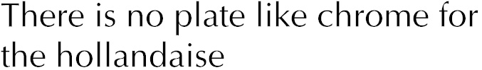
This face was cut by one of the most famous designers of the twentieth century, Herman Zapf, and has the distinction of being perhaps the most plagiarized face in history. When it was introduced it was wildly successful, but because of a loophole in copyright law, only the name of the face could be protected. The shapes of the letters and the design concepts behind them were not protected and any type foundry that wanted to, could copy Zapf's font and use it as long as they gave it a new name.
